
Brandon Sepulvado


I ended the last post by highlighting differences in keywords of publications related to bioethics on the Web of Science that were used in consecutive years, in multiple but non-consectuive years, and in only a single year. In this post, I will predict the number of years in which a keyword is used to categorize journal articles.
Before employing statistical models, it would be prudent to examine visually the data. Here are the visualizations with which I ended the previous blog post.
consec.evo <- consec.evo %>%
mutate(usage.type = case_when(
consec == TRUE ~ "Persist",
consec == FALSE ~ "Recur",
is.na(consec) ~ "Single"
))
consec.evo %>%
ggplot(aes(x = year, y = n, color = usage.type)) +
geom_line() +
xlab("Year") +
ylab("Keyword count") +
ggtitle("Trends in keyword usage by usage type") 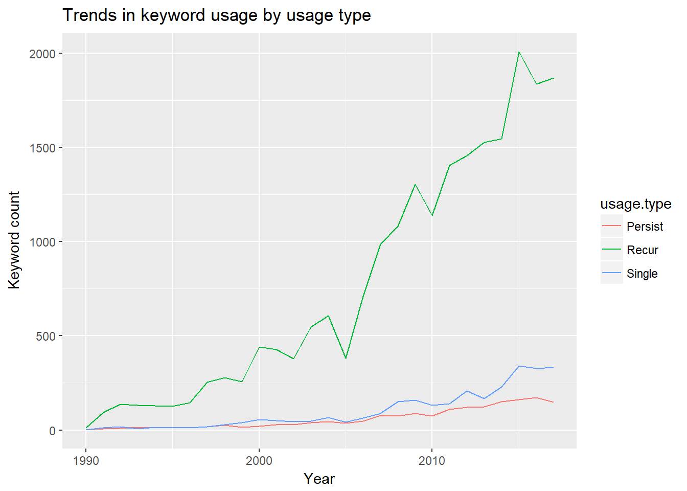 For this visualization, I renamed the
 consec variable and its levels to usage.type and persist, recur, and single. Persist indicates that a keyword has been used in multiple, consecutive years, and recur indicates that a keyword has been used in multiple, non-consecutive years. Single refers to keywords that have been employed in only one year. Over this roughly 27 year period, recurrent keywords categorize articles the most frequently and at an increasing rate. Persistent and single-use keywords occur at roughly the same rate, although there is a marked difference starting around 2013.
Now, let’s examine visually the distributions of the number of years for the persist and recur usage types.
keyword.evo %>%
filter(!is.na(consec)) %>% # NA = one year
ggplot(aes(num.yrs.active, color = consec, fill = consec)) +
geom_density(alpha = .5) +
scale_fill_discrete(name='Usage group',labels=c("Recur", "Persist"))+
scale_color_discrete(name='Usage group',labels=c("Recur", "Persist")) +
xlab("Number of years a keyword is active") +
ylab("Density") +
ggtitle("Distribution of years active by whether consecutive") +
theme_minimal() 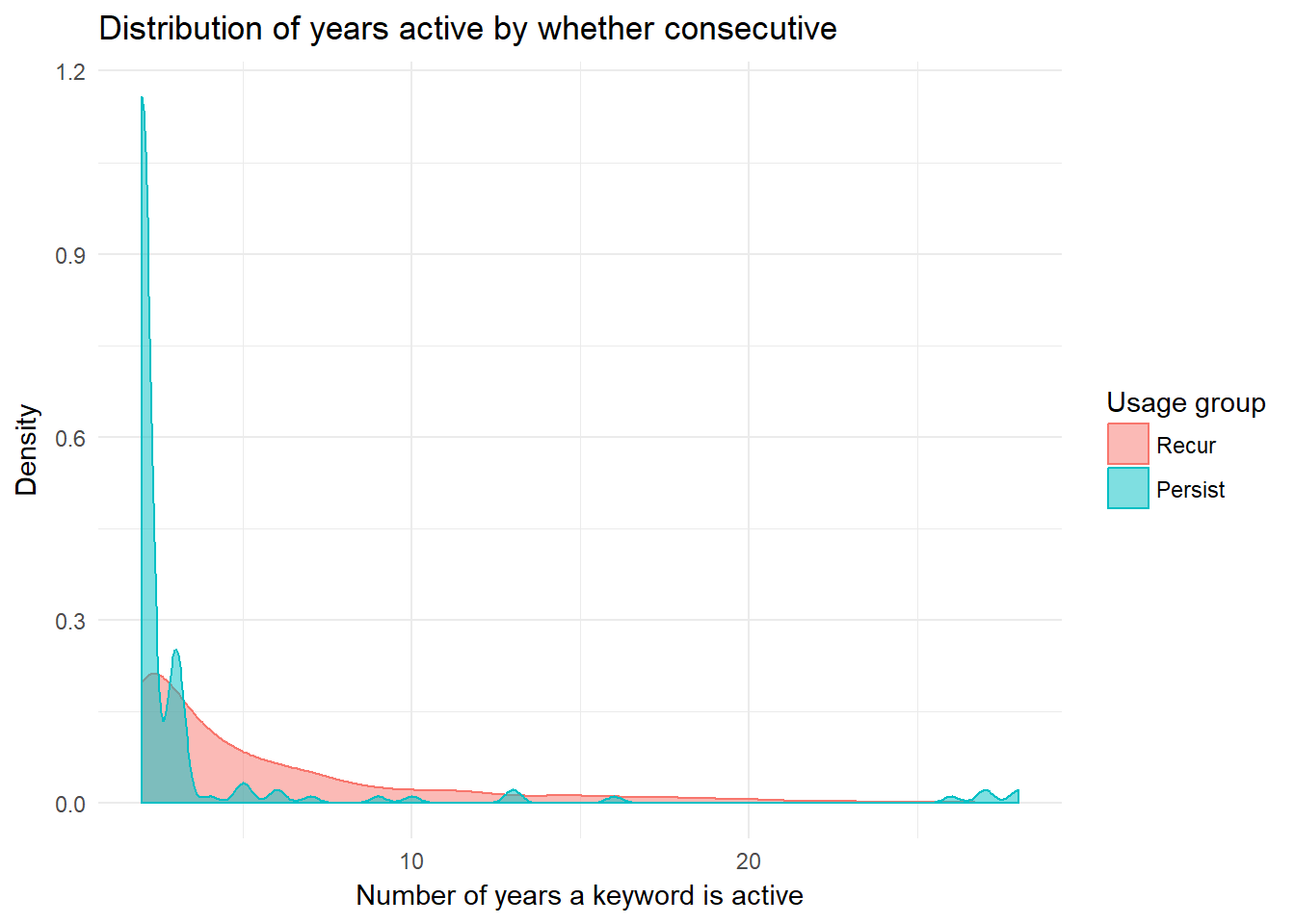 The two distributions appear to differ greatly. Recur has more density spread farthest along the x axis, but persist has the highest maximum value. These two groups clearly exhibit distinct behaviors.
The models below will investigate these group differences in the number of years during which a keyword is active, but I first want to examine in further detail the patterns of usage among keywords that are employed during multiple years. The next chunk of code creates a new object called year.diffs. To do so, I isolate the distinct years in which each unique keyword is used, take the difference between adjacent years in the vector (assigned to a variable called diffs), and then note the position of each difference in the vector of differences (assigned to a variable called position). I also include a keyword variable to identify to which keyword the differences and positions refer. Each row is uniquely identified by keyword plus position, as diffs might have multiple equivalent values for a given keyword.
year.diffs <- vector("list", length = nrow(test.bind))
for (i in 1:length(year.diffs)) {
  year.diffs[[i]] <- test.bind %>%
    filter(keyword == keyword.evo$keyword[i]) %>%
    distinct(year) %>%
    as.matrix() %>%
    diff() %>%
    as.data.frame() %>%
    mutate(keyword = keyword.evo$keyword[i])
}
year.diffs <- bind_rows(year.diffs)
year.diffs <- year.diffs %>%
  select(-.) %>%
  rename(diffs = year) %>%
  group_by(keyword) %>%
  mutate(position = 1:n())
year.diffs <- year.diffs %>%
  ungroup()

head(year.diffs)
## # A tibble: 6 x 3
## diffs keyword position
## <dbl> <chr> <int>
## 1 19.0 healing 1
## 2 2.00 healing 2
## 3 5.00 healing 3
## 4 4.00 culture 1
## 5 4.00 culture 2
## 6 1.00 culture 3The head() function at the end of this code provides an idea about the organization of year.diffs. For example, one can see that healing appears three times in this object, which means that it originally was used during four years. There was a gap of 19 years between its first and second years used, 2 yeas between its second and third years used, and 5 between its third and fourth years used.
Given the large number of keywords that appear in multiple years with at least one non-consecutive jump, let’s check out the histogram of the maximum non-consecutive differences. The x-axis will begin at 2 because that is the smallest non-consecutive difference.
year.diffs %>%
  filter(diffs > 1) %>%
  group_by(keyword) %>%
  summarise(diffs.max = max(diffs)) %>%
  ggplot(aes(diffs.max)) +
  geom_histogram() +
  ggtitle("Density plot of max non-consecutive year differences") +
  xlim(2, 30) +
  xlab("Maximum non-consecutive difference in years used") +
  ylab("Number of occurrences")
Now, I want to know, for each non-consecutive sequence, how many times are there non-consecutive years?
year.diffs %>%
  group_by(keyword) %>%
  filter(diffs > 1) %>%
  summarise(num = n()) %>%
  summarise(n_distinct(num)) # 9 distinct values
## # A tibble: 1 x 1
## `n_distinct(num)`
## <int>
## 1 9year.diffs %>%
group_by(keyword) %>%
filter(diffs > 1) %>%
summarise(num = n()) %>%
ggplot(aes(as.factor(num))) +
geom_bar(show.legend = FALSE) +
xlab("Number of non-consecutive usages") +
ylab("Count") +
ggtitle("Frequency of unique values of non-consecutive uses")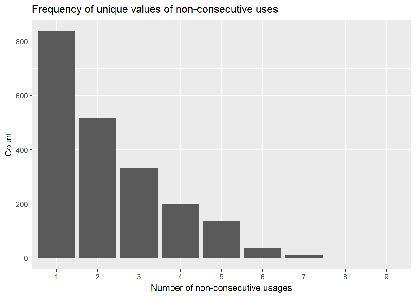 This bar graph suggests that the plurality of nonconsecutively used keywords have only one nonconsecutive break, yet there is a considerable portion of other cases have multiple nonconsecutive breaks.
I also want to know when different sized breaks in continuity occur; the following graph will plot the difference position against the difference magnitude.
ggplot(year.diffs, aes(position, diffs)) +
geom_jitter(aes(color = as.factor(position)), show.legend = FALSE) +
xlab("Position") +
ylab("Difference") +
ggtitle("Plot of differences by position") +
theme_minimal()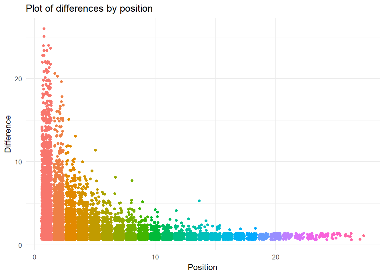 This jitter plot presents interesting results. Similar to a boxplot, this graphic allows one to see the density of inter-year differences for each position. The minimum position is one (because a keyword must be used at least twice to have a difference).
This is a boxplot of the same data.
year.diffs %>%
ggplot(aes(position, diffs)) +
geom_boxplot(aes(group = as.factor(position)))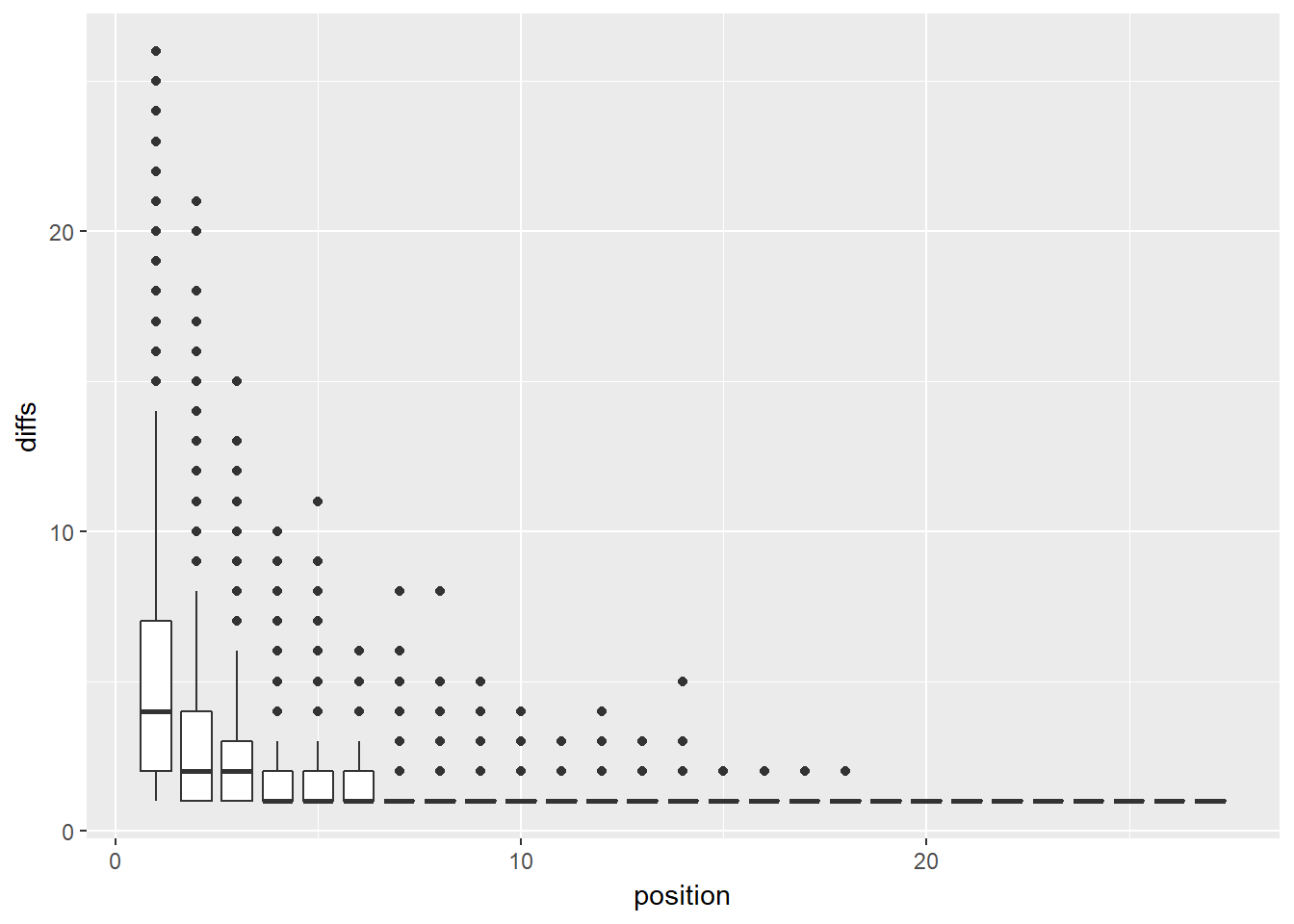 This boxplot does not look as nice as the jitter plot. More importantly, while it does indicate outliers, much of the information is incomprehensible due to the tight clustering of cases near zero.
Before I get to the model estimation, it is necessary to provide an overview of my analytic strategy. The basic unit in the models will be the keyword, which means the predictors will need to be attributes about the keyword, but what attributes—aside from the number of active years and usage group—are present in the data? Without getting into too much theoretical justification (this will be in the forthcoming paper), I am interested in how relational attributes of keywords qua product categories in the academic/scientific market influence their lifecycle.
One may derive networks among the keywords because each keyword occurence is associated with a unique journal article. Two approaches to arriving at this network present themselves. First, one may create a bipartite network in which keywords are connected to journal articles; second, one may employ the tidytext package to create bigrams from the author keyword cell. These approaches ultimately can result in the same data structure, and I will use both in this series on bioethics keywords. Two keywords will be connected if they were used to describe the same journal article, and the weight of their relationship will correspond to the number of papers in which they co-occured.
What are the attributes in which I am interested? The first two are degree and the local clustering coefficient: that is, the number of keywords to which each keyword is connected and the ego network density. Degree and clustering would seem to be positively related to the number of years in which a keyword is employed. If a keyword is related to many others, then it might be used more, which would increase the likelihood of its extended temporal distribution, and, if the keyword is a member of a densely connected group of keywords, then they might form a subspeciality associated with an active community of scholars. The remaining attributes pertain to the distribution of weights within the ego network (the set of relationships in which a focal keyword is involved) of each keyword.
The first thing I will do is to determine which type of count model is best to estimate given the data; I here adjudicate between the two main contenders: Poisson and negative binomial regression models. For a good introduction to choosing between these two model types, check out UCLA’s Institute for Digital Research and Education. It is important to note here that there will be no zeros in the data used to estimate the models, and, as such, zero truncated models are appropriate. However, I do not include them in this blog post (they may be found in the forthcoming paper) because the output of the function to estimate zero-truncated negative binomial models does not work well with the model evaluation functions I want to use below and because these estimates do not substantively differ from the regular models. Feel free to send me an email if you would like the results of the zero-truncated models.
Before I go any further, I want to remove keywords in the “single” usage group because it perfectly predicts a num.yrs.active value of one. I also create a new variable, which is simply a factor version of consec.
keyword.data.0 <- keyword.data.0 %>%
  mutate(consec.factor = as.factor(consec))

keyword.data.reduced <- keyword.data.0 %>%
  filter(consec.factor != "single")
The following summary indcates the variance is greater than the mean, which suggests that a negative bionomial model is more appropriate.
keyword.data.reduced %>%
  filter(!is.na(num.yrs.active)) %>%
  summarise(var(num.yrs.active), mean(num.yrs.active))
## # A tibble: 1 x 2
## `var(num.yrs.active)` `mean(num.yrs.active)`
## <dbl> <dbl>
## 1 23.9 5.54However, we can explicitly test this by running both types of model and then using a likelihood ratio test for a comparison. I present the comparison between two base models containing only degree and local clustering coefficient, but the sustantive takeaway remains unchanged with the later models.
# negative binomial model
# MASS masks select from dplyr and tidygraph
nb.0 <- MASS::glm.nb(num.yrs.active ~ degree + lcc,
                             data = keyword.data.reduced,
                     control=glm.control(maxit=50))
# poisson model
pois.0 <- glm(num.yrs.active ~ degree + lcc,
              family = "poisson",
              data = keyword.data.reduced)

screenreg(list(pois.0, nb.0),
          custom.model.names = c("Poisson", "Negative Binomial"))
##
## ===============================================
## Poisson Negative Binomial
## -----------------------------------------------
## (Intercept) 3.27 *** 3.12 ***
## (0.03) (0.04)
## degree 0.00 *** 0.01 ***
## (0.00) (0.00)
## lcc -3.59 *** -3.32 ***
## (0.07) (0.08)
## -----------------------------------------------
## AIC 9770.43 9599.46
## BIC 9787.54 9622.27
## Log Likelihood -4882.22 -4795.73
## Deviance 2420.53 1682.69
## Num. obs. 2215 2215
## ===============================================
## *** p < 0.001, ** p < 0.01, * p < 0.05# which is preferable
chi2 <- 2 * (logLik(nb.0) - logLik(pois.0))
pchi2 <- pchisq(2 * (logLik(nb.0) - logLik(pois.0)), df = 1, lower.tail = FALSE)
print(paste0("Chi-squared value ", chi2))## [1] "Chi-squared value 172.977326540651"print(paste0("P-value for chi-squared ", pchi2))## [1] "P-value for chi-squared 1.65546825142021e-39"As shown in the table, the log counts produced by the two models are pretty similar, with the local clustering coefficient having the largest discrepancy. The likelihood ratio test and its corresponding p-value indicate that the negative binomial model is preferable. I will employ negative binomial regression for the following models.
The next two models add attributes about tie weights (i.e., mean and range) as well as the consec category.
nb.1 <- MASS::glm.nb(num.yrs.active ~ degree + lcc + mean + range,
                     data = keyword.data.reduced,
                     control=glm.control(maxit=100))

nb.2 <- MASS::glm.nb(num.yrs.active ~ degree + lcc  + mean + range +
                       consec.factor,
                     data = keyword.data.reduced,
                     control=glm.control(maxit=100),
                     na.action = na.exclude)

screenreg(list(nb.0, nb.1, nb.2),
          custom.coef.names = c("Intercept",
                              "Degree",
                              "Clustering",
                              "Mean (ego weight)",
                              "Range (ego weight)",
                              "Recur"))
##
## ============================================================
## Model 1 Model 2 Model 3
## ------------------------------------------------------------
## Intercept 3.12 *** 3.10 *** 2.86 ***
## (0.04) (0.04) (0.07)
## Degree 0.01 *** 0.01 *** 0.01 ***
## (0.00) (0.00) (0.00)
## Clustering -3.32 *** -3.33 *** -3.27 ***
## (0.08) (0.08) (0.08)
## Mean (ego weight) 0.02 *** 0.02 ***
## (0.00) (0.00)
## Range (ego weight) -0.01 *** -0.01 ***
## (0.00) (0.00)
## Recur 0.22 ***
## (0.06)
## ------------------------------------------------------------
## AIC 9599.46 9590.54 9576.68
## BIC 9622.27 9624.76 9616.60
## Log Likelihood -4795.73 -4789.27 -4781.34
## Deviance 1682.69 1680.90 1674.33
## Num. obs. 2215 2215 2215
## ============================================================
## *** p < 0.001, ** p < 0.01, * p < 0.05The predictors added in Models 2 and 3 are significant at the p < .001 level, and the indicators at the bottom of the table suggest that there is a general immprovement. However, let’s run some tests to have further certainty.
nb.1.update <- update(nb.1, . ~ . - mean - range)
## test model differences with chi square test
anova(nb.1, nb.1.update) # two degree-of-freedom chi-square test
## Likelihood ratio tests of Negative Binomial Models
##
## Response: num.yrs.active
## Model theta Resid. df 2 x log-lik. Test
## 1 degree + lcc 17.80100 2212 -9591.456
## 2 degree + lcc + mean + range 18.22467 2210 -9578.543 1 vs 2
## df LR stat. Pr(Chi)
## 1
## 2 2 12.91285 0.001570399This two degree-of-freedom chi-squared test indicates that Model 2 is preferable to Model 1. How does Model 2 compare to Model 3?
nb.2.update <- update(nb.2, . ~ . - consec.factor)
anova(nb.2, nb.2.update)
## Likelihood ratio tests of Negative Binomial Models
##
## Response: num.yrs.active
## Model theta Resid. df
## 1 degree + lcc + mean + range 18.22467 2210
## 2 degree + lcc + mean + range + consec.factor 18.59242 2209
## 2 x log-lik. Test df LR stat. Pr(Chi)
## 1 -9578.543
## 2 -9562.682 1 vs 2 1 15.8606 6.818372e-05These results confirm the intuition from the table: Model 3 is the most preferable model.
Before interpreting Model 3, I will display again the results, and I will also include a coefficient plot from the texreg package. A one unit increase in degree (i.e., a keyword having one extra connection to another keyword) corresponds to a miniscule .00676 increase in the log number of active years, and a one unit increase in the local clustering coefficient predicts a 3.27 decrease in a keyword’s log number of active years. The two attributes concerning the weights of ties in which a keyword is involved exhibit opposite effects. A one unit increase in the mean tie weight corresponds to a .0164 increase in the log number of active years, while, for a one unit increase in the range of a keyword’s ego network tie weights, the expected log number of active years decreases by .0143. Compared to keywords that appear in consecutive years (“persist”), non-consecutive words have a log number of active years that is higher by .220.
summary(nb.2)##
## Call:
## MASS::glm.nb(formula = num.yrs.active ~ degree + lcc + mean +
## range + consec.factor, data = keyword.data.reduced, na.action = na.exclude,
## control = glm.control(maxit = 100), init.theta = 18.59241688,
## link = log)
##
## Deviance Residuals:
## Min 1Q Median 3Q Max
## -5.3945 -0.6687 -0.1368 0.4440 3.3291
##
## Coefficients:
## Estimate Std. Error z value Pr(>|z|)
## (Intercept) 2.8582343 0.0705716 40.501 < 2e-16 ***
## degree 0.0067637 0.0004916 13.758 < 2e-16 ***
## lcc -3.2703948 0.0790910 -41.350 < 2e-16 ***
## mean 0.0164384 0.0037479 4.386 1.15e-05 ***
## range -0.0143303 0.0036717 -3.903 9.50e-05 ***
## consec.factorrecur 0.2195409 0.0550104 3.991 6.58e-05 ***
## ---
## Signif. codes: 0 '***' 0.001 '**' 0.01 '*' 0.05 '.' 0.1 ' ' 1
##
## (Dispersion parameter for Negative Binomial(18.5924) family taken to be 1)
##
## Null deviance: 5433.4 on 2214 degrees of freedom
## Residual deviance: 1674.3 on 2209 degrees of freedom
## AIC: 9576.7
##
## Number of Fisher Scoring iterations: 1
##
##
## Theta: 18.59
## Std. Err.: 1.80
##
## 2 x log-likelihood: -9562.682plotreg(nb.2)## Model 1: bars denote 0.5 (inner) resp. 0.95 (outer) confidence intervals (computed from standard errors).
Let’s also look at the results as incidence rates.
est <- cbind(Estimate = coef(nb.2), confint(nb.2))
exp(est)
## Estimate 2.5 % 97.5 %
## (Intercept) 17.43072183 15.10498804 20.08741103
## degree 1.00678661 1.00562108 1.00797485
## lcc 0.03799143 0.03245402 0.04443781
## mean 1.01657427 1.00750807 1.02581463
## range 0.98577188 0.97747124 0.99414979
## consec.factorrecur 1.24550485 1.11694638 1.39178571Recurrent keywords have an incident rate that is 1.25 times persistent keywords, holding the other variables constant. The number of active years increases by almost 1% for a one unit increase in degree, and it decreases by roughly 96% for a one unit increase in the local clustering coefficient (which is drastic and the maximum possible increase). A one unit increase in the mean of the mean weight corresponds to an almost 2% increase in the incident rate of active years, while a one unit increase in weight range predicts a 1.4% decrease in the incident rate of num.yrs.active.
The margins package provides a wonderful function (cplot) for visualizing the change in estimates associated with different values of a predictor, holding constant the other predictors.
cplot(nb.2, "degree",
what = "prediction",
main = "Predicted # of active years, given degree",
xlab = "Degree")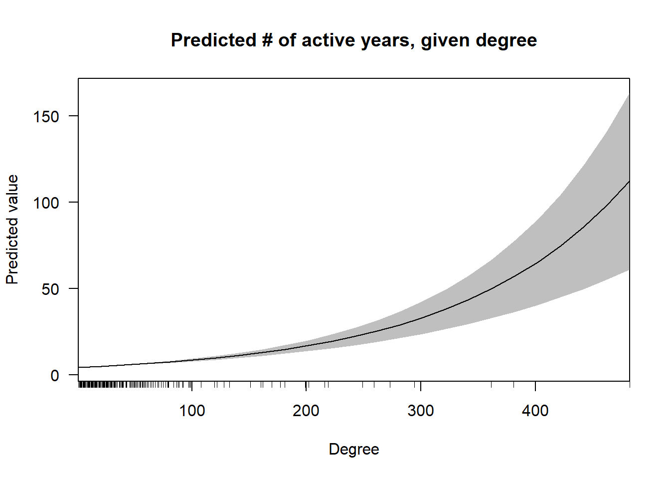 In this first graph, one can see that the effect of degree on predicted value increases non-linearly, although the confidence intervals also greatly expand as the density of cases with very high degree is low.
cplot(nb.2, "lcc",
what = "prediction",
main = "Predicted # of active years, given clustering",
xlab = "Clutering coefficient")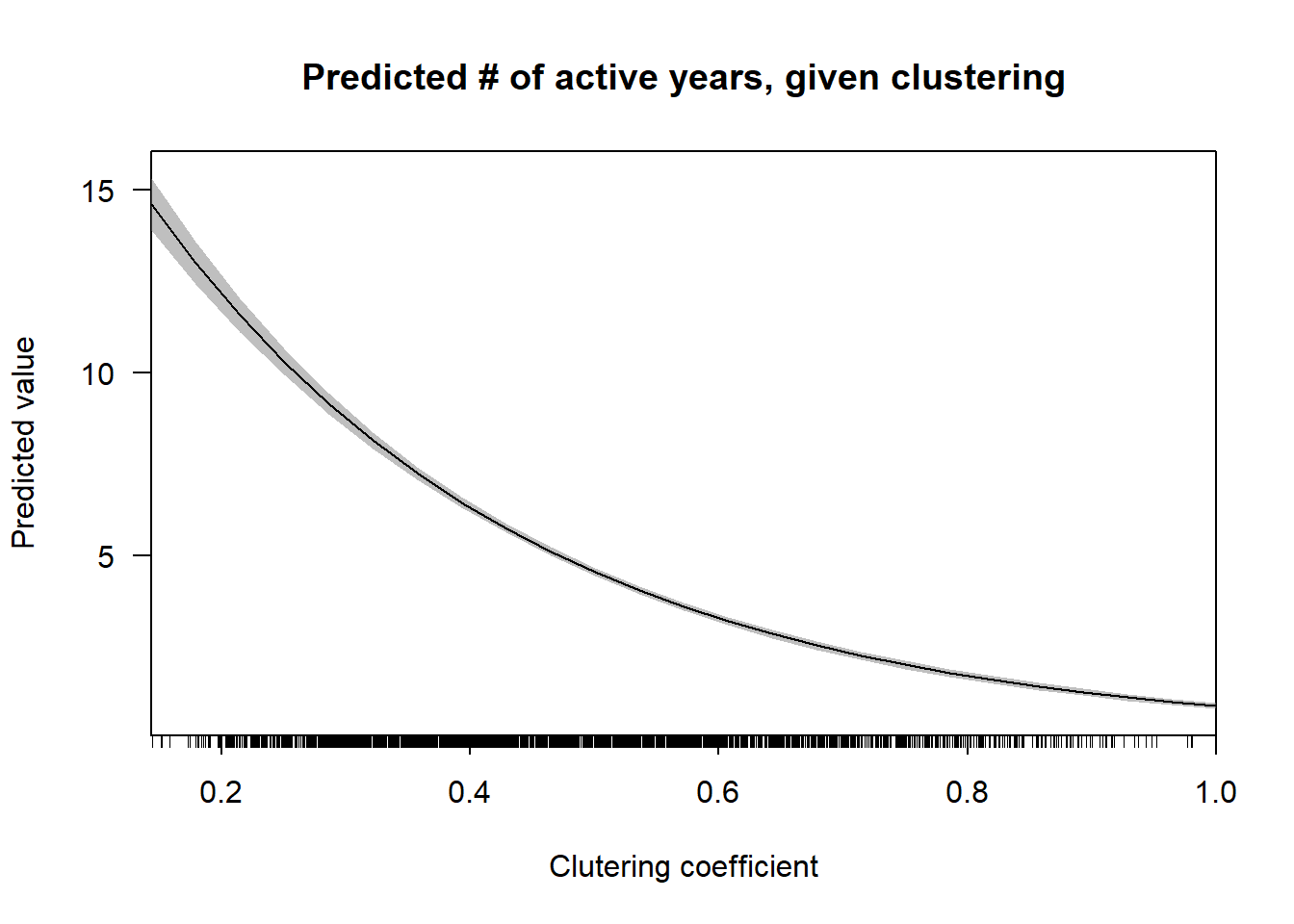 Unlike degree, the local clustering coefficient has a non-linear inverse relationship with predicted number of years active.
cplot(nb.2, "mean",
what = "prediction",
main = "Predicted # of active years, given mean weight",
xlab = "Mean weight")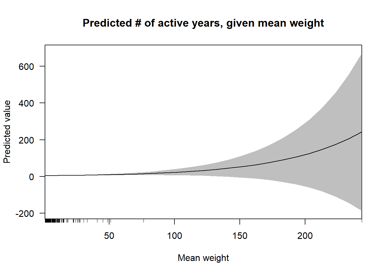 This plot echoes the results in the above tables. There is a very slight positive relationship between the mean of tie weights in a keyword’s ego network, yet the confidence intervals in the right half of the visualization prevents one from knowing whether or not the relationship is non-linear.
cplot(nb.2, "range",
what = "prediction",
main = "Predicted # of active years, given range of weights",
xlab = "Weight range")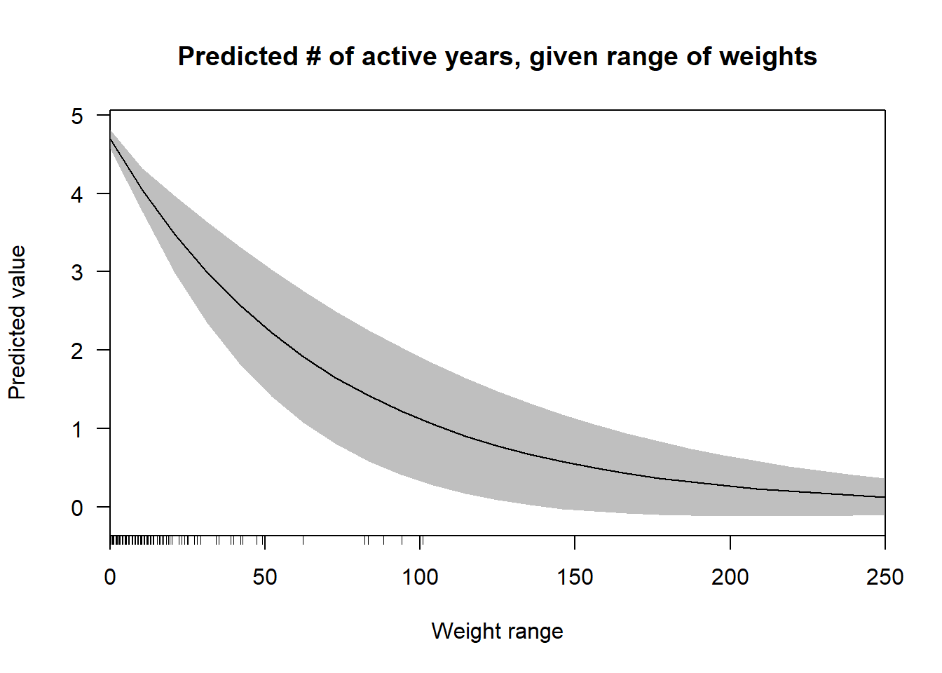 Even though the confidence intervals are quite wide here, it is possible to identify a definite non-linear decrease in the relationship between the weight range and the predicted values. This trend
cplot(nb.2, "consec.factor",
what = "prediction",
main = "Predicted # of active years, given usage group",
xlab = "Usage group")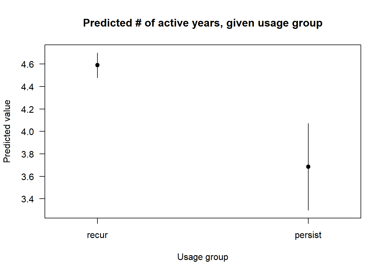 Finally, while the persist category has much wider confidence intervals, it is nonetheless clearly associated with lower estimate.
Finally, let’s look at a few last graphs. In this first visualization, I graphed the estimates against the observed number of active years for the keywords. For approximately the first (left-most) third of observed values, the predictions slightly overestimate, and, for the remaining observed values, the predictions underestimate num.yrs.active. However, after 23 on the x-axis, many predictions are severe overestimates.
keyword.data.reduced <- keyword.data.reduced %>%
  mutate(prediction = predict(nb.2, keyword.data.reduced,
                               type = "response"))

ggplot(keyword.data.reduced, aes(x = num.yrs.active,
                           y = prediction)) +
  geom_point() +
  geom_abline() +
  ylab("Prediction") +
  xlab("Observed umber of years active") +
  ggtitle("Predicted values versus observed number of years active")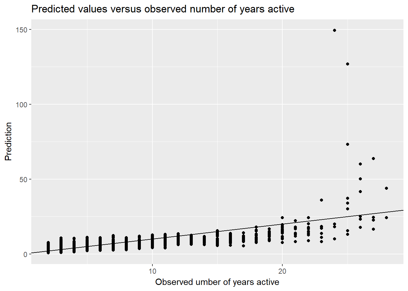
The next two visualizations compare, for the persist and recur usage groups, residuals against the observed and predicted number of years active values.
keyword.data.reduced <- keyword.data.reduced %>%
mutate(residual = num.yrs.active - prediction)
keyword.data.reduced %>%
filter(!is.na(consec.factor)) %>%
ggplot(aes(x = num.yrs.active,
y = residual,
color = consec.factor,
shape = consec.factor)) +
geom_point(show.legend = FALSE) +
geom_hline(yintercept = 0) +
ylim(-50, 50) +
facet_wrap(~ consec.factor, nrow = 1) +
xlab("Number of years active") +
ylab("Residual") +
ggtitle("Residual versus observed number of years active by usage group")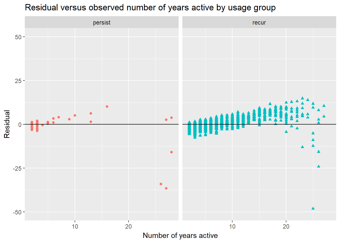 In the first of these two graphs, I have plotted the residuals versus observed values by group. Unfortunately, the seems to be a non-random relationship between the number of years active and the residuals.
Likewise, in the last graph where I visualize the relationship between the residuals and fitted values, there are obvious non-random relationships in both groups.
keyword.data.reduced %>%
  filter(!is.na(consec.factor)) %>%
  ggplot(aes(x = prediction,
             y = residual,
             color = consec.factor,
             shape = consec.factor)) +
    geom_point(show.legend = FALSE) +
    geom_hline(yintercept = 0) +
    ylim(-50, 50) +
    xlim(0, 75) +
    facet_wrap(~ consec.factor, nrow = 1) +
    xlab("Predicted number of years active") +
    ylab("Residual") +
ggtitle("Residual versus predicted number of years active by usage group") 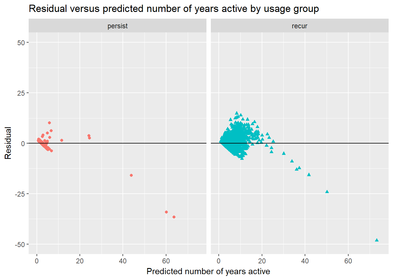
The visualizations and regression results in this post uncover interesting results. There are systematic differences between the keyword usage groups, particularly regarding the “lifespans” of these keywords, and the number of years in which keywords are active is associated—at least in part—with how each keyword is linked to the others. The negative binomial models presented here obviously pose problems in their predictive abilities. On the one hand, the incompleteness of the purely relational attributes should not be surprising. I included only four predictors, and other factors, such as attributes of the individuals who employ the categories, are surely at play. On the other hand, there is more to be done in specifying the relationships between the included predictors and num.yrs.active, which will of course be the focus of the next post!